For mens’ lifestyle guide Thrillist, the email newsletter has always been at the heart of
its content strategy. It’s how the site keeps its 2 million subscribers in the know about new restaurants, bars, and places to shop in 21 cities nationwide from New York to Seattle.
But
as properties from Facebook to Pandora to LinkedIn are finding, more and more of its users are now accessing its content from mobile devices rather than the desktop Web. Over the last year or so, the
share of readers coming to the newsletter via mobile has grown from a small fraction to 30% to 40%, according to Thrillist CEO Ben Lerer's estimates.
That meant mobile users had to
“pinch and zoom” the screen to enlarge text and images because the email publication had not been optimized for mobile. “We said we have to optimize…so about six months ago we
started coding for mobile first,” said Lerer.
advertisement
advertisement
A big part of that effort has been simplifying things for the mobile environment. In practice it has meant tailoring images to the smaller
format, reducing the amount of text and stripping out extra buttons that tend to clutter up the mobile screen.
Instead, Thrillist focused on the key features thay users valued most -- getting
contact and mapping information for a venue, and the ability to save and share content. “We pared it down to the stuff that people wanted,” said Lerer.
Likewise, the company
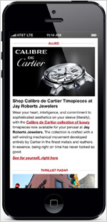
optimized its native ad units, labeled as “Allied” content for the mobile screen, with a prominent image above a paragraph of text that links to a site or ad landing page. A Cartier ad,
for example, features an eye-catching photo of a watch in the brand’s Calibre de Cartier line, with a chunk of text and links to the Web page for that collection.
Since updating the
custom ad format for mobile, Thrillist has seen click-throughs more than double. The company says mobile visits to the Web site via mobile have also more than doubled (up 121%). The email
click-through rate is up 35%. The property also operates a mobile site and has iPhone, iPad and Android apps, updates are in the works.
The current mobile version of its site launched only a
month ago and will be continuously refined in the coming weeks. The Thrillist apps will also get a refresh during the first half of the year.
Lerer pointed out that the company’s app for
its JackThreads sub-brand, which he called a “best-in-class “mobile experience, provides a model for how the Thrillist app will be upgraded. But while the fashion-focused site now drives
about 20% of its ad revenue from mobile, Thrillist itself hasn’t seen mobile revenue reach that level yet.
“We now have the supply if people want to shift dollars that way; we have
real mobile engagement on a daily basis, and an ad product that can be really valuable. But we haven’t seen a massive shift in ad dollars moving in that direction yet,” said Lerer.