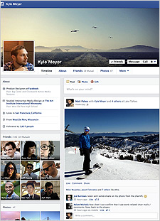
On the heels of its news feed overhaul, Facebook on Wednesday began rolling out a redesigned version
of Timeline. Launched on a limited basis last month, the new look does away with the two-column format in favor of a cleaner layout featuring a main column with user posts and life events.
Music, photos, recent app activity and user’s “About” information have been shifted to a smaller section on the left side of the page. In a blog post announcing the Timeline update, Facebook said people found the previous design sometimes hard to read across two evenly
sized columns.
advertisement
advertisement
The About page offers more options for people to highlight their favorite movies, TV shows, books, as well as fitness activity among other interests. For each category, the page
will also show activity from relevant Open Graph apps such as Netflix and Flixster for movies and Goodreads for books.
Sections for movies, books, music and other content include new
“Want to Watch,” “Want to Read” and “Listen Later” buttons. People will see suggestions for shows to add, and will have the ability to create their their own lists.
“This could encourage users to add more intent-based information to Facebook, which could be used for ad targeting,” according to the Inside Facebook blog.
Users can also add sections focused on individual apps to reflect additional interests. Someone, for example,
might include their Instagram photo stream as a section on their Timeline. Apps can be removed from the About page via a user’s activity log.
Facebook CEO Mark Zuckerberg has described
Timeline as one of the “three pillars” of the Facebook ecosystem along with the news feed and newer Graph Search feature. But since its launch in late 2011 as a way to mark major life
events, Timeline has hardly won over users. Cleaning up the design and giving people greater ability to shape their Timelines could help generate more activity and interaction with the scrapbooking
feature.