In
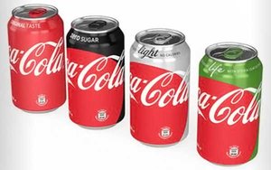
another significant step in its new “One Brand” strategy, Coca-Cola has begun rolling out new packaging designs that will unify the brand’s look across its product portfolio on a
global basis.
The “Red Disc,” a key element in the One Brand “Taste the Feeling” advertising campaign that Coke launched in January, will appear on all of
the brand’s packaging. “Taste the Feeling” is now live in 195 markets and includes 12 television commercials.
“Packaging is our most visible and valuable
asset,” and the Red Disc is critical in unifying the brand’s visual identity," said Marcos de Quinto, CMO of The Coca-Cola Company, in a statement.
This marks the
first time in the brand’s 130-year history that Coca-Cola’s visual identity system has been shared across all products, as well as all media, pointed out James Sommerville, the
company’s VP global design, in the Coca-Cola Journey site.
advertisement
advertisement
“Consumers will see the Coca-Cola Red Disc in all global markets at the end of our ‘Taste
the Feeling’ TV ads, in our print ads and on our billboards,” he said. “Using this same device on packaging completes the picture. Although the Red Disc is not always presented in
exactly the same way – whether it’s placed around a pack or animating in a TV ad – the result is a consistent brand signature that refreshes our familiar Red Disc icon, yet applies
it in a systematic and modern way.”
Given that the products will all share Coca-Cola’s signature red color on packaging, signature product colors will also continue to
appear on packaging to help consumers readily distinguish them: black for Zero, silver for Light/Diet and green for Life.
In addition, for varieties other than Coca-Cola
Original (or “Classic,” in some markets), the front of the new packaging will include a description of benefits along with the name: Coca-Cola Light/Diet: Crisp Taste, No Calories;
Coca-Cola Zero: Zero Sugar; and Coca-Cola Life: Less Sugar, With Stevia Leaf Extract.
The new packaging system is being introduced first in Mexico, where the redesigned products
will be available in stores in the first week of May. Similar versions of the graphics will be rolled out to other markets around the world throughout 2016 and into 2017.
However,
packaging changes won’t be seen in the U.S. this year. Coca-Cola has said that it’s still testing in North America, and that one challenge is how to handle Diet Coke. Diet Coke is big in
the U.S. and some other markets, but its name doesn’t readily integrate with the umbrella design’s use of the Coca-Cola name in script. (In many markets, the diet version is called
Coca-Cola Light.)
With the Coca-Cola Company in the midst of cutting $3 billion in costs, the unified packaging design might also enable some cost efficiencies in advertising,
noted The Wall Street Journal.