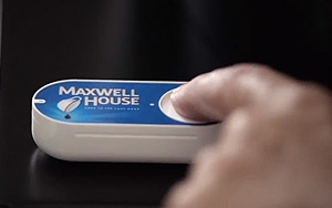
The e-commerce masterminds over at Amazon never seem to tire of inventing devices to push one-click shopping deeper into consumers’ brains. The latest? The Amazon Dash
Button.
Currently being offered by invitation only to Amazon Prime customers, it takes last year’s Amazon Dash — a little wand you use to scan items around the
house that you’d like to repurchase — one step further, creating Dash Buttons for such oft-used products as Tide laundry detergent, Huggies diapers, Maxwell House coffee or Wellness cat
food.
The buttons, which include the brand logo, come with a self-adhesive back so they can be mounted right next to the coffeemaker or washing machine, for example. “When
you're running low, simply press Dash Button and Amazon quickly delivers household favorites at the same low prices offered on Amazon.com, so you can skip the last-minute trip to the store,” the
company explains in its announcement. (It has also created a video that explains it.)
advertisement
advertisement
While Americans still spend very
little on groceries online, the market is growing fast — gaining steam not just from Amazon, but from national brands such as Whole Foods Markets and Walmart, as well as many regional
stores. Brick Meets Click recently updated its forecast, and now predicts that by 2023, U.S. online grocery spending will hit between 11% and 17% in most markets, ranging from $80 to $123 billion.
The Dash Button may be small, but it’s just one more way Amazon is gunning for a massive market. “Amazon is competing with two sets of customers for the sale of broadly used
and frequently consumed consumer packaged goods — traditional brick-and-mortar retailers, as well as other online retailers including ones expected to come on the scene like Jet.com,” says
Bill Bishop, chief architect at Brick Meets Click.
He tells Marketing Daily the novelty of the Dash Button will likely attract new members to Prime, “but the main point
is it’s part of an ongoing process to build the base, and encourage Prime customers to shift more spending to the program.”
And perhaps a bigger issue is that the Dash
Button, like many of Amazon’s previous innovations, puts pressure on other retailers to keep up, says Wendy Liebmann, CEO and chief shopper at WSL Strategic Retail. “Amazon just keeps
making it easier not to go to the store for basics. The more turnkey it is, the more it saves shoppers time, the more Amazon becomes embedded into the shopper's psyche and life,” she tells
Marketing Daily. “And that's a worry for traditional retailers. Each time they make a move and catch up, Amazon finds another way to push ahead.”
Still,
she’s not so sure Amazon’s Dash Button will catch on — because frankly, who wants their house to look like an end cap at Walmart?
“It will look
like our house cut itself shaving,” she says. “One or two are good, but 20 will be ugly. It's the challenge of easy versus ugly. Ugly loses in my house.”